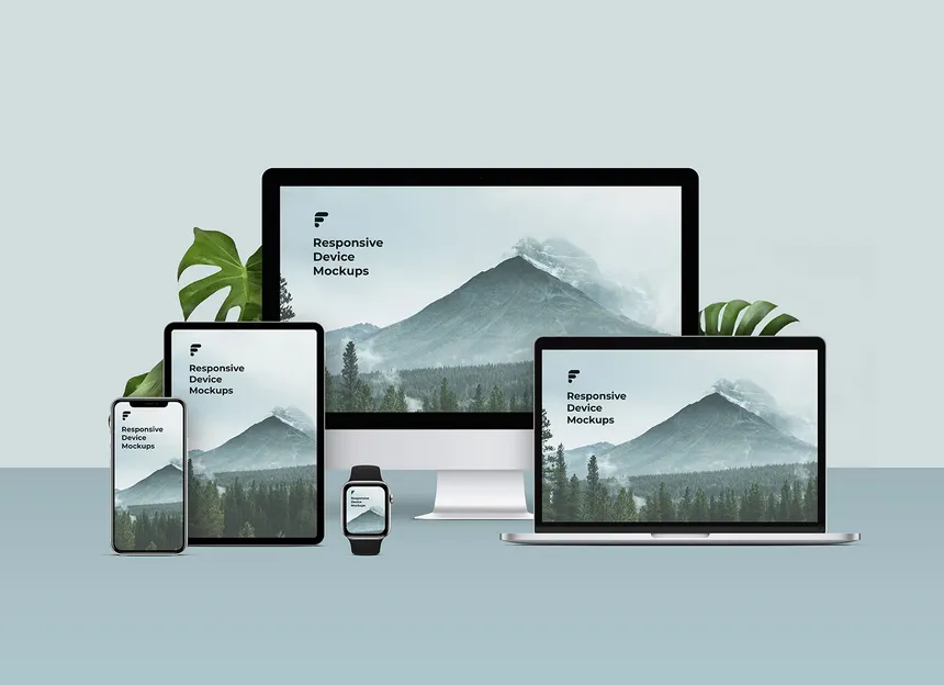
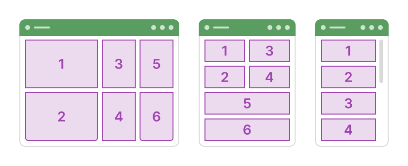
Responsive Web Design

RESPONSIVE DESIGN

Design Once.
Look Perfect Everywhere.

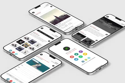
We create visually stunning, responsive websites that adapt beautifully across desktops, tablets, and smartphones — without sacrificing performance or brand consistency.

Every layout is crafted with precision, ensuring smooth interactions, perfect spacing, and flawless usability on all screen sizes.

Responsive Website Mockup
DEVICE EXPERIENCE

One Design. Multiple Experiences.

Desktop Experience
Desktop Experience
Tablet Experience
Tablet Experience
Mobile Experience
Mobile Experience
DESIGN PRINCIPLES

Built for Every Screen

Fluid Layouts

Layouts that stretch, shrink, and rearrange seamlessly using modern CSS grid systems.

Fluid Layouts

Mobile-First Performance

Optimized for real-world mobile usage with lightning-fast load times.

Mobile-First Performance

Visual Consistency

Your brand identity remains strong and consistent on every screen.

Visual Consistency

Ready for a Website That Feels Premium?

Let RS Digital Solutions craft a responsive website that looks stunning, performs flawlessly, and elevates your brand across all devices.